1. The Challenge & Context
01
A Croatia-based event management startup approached me with a clear vision but a blank slate. They had secured the name “Opera” for their new nightclub in Vodice—a bustling Adriatic destination frequented by international tourists. However, they lacked any visual identity or digital infrastructure.
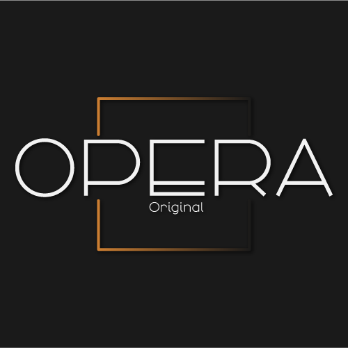
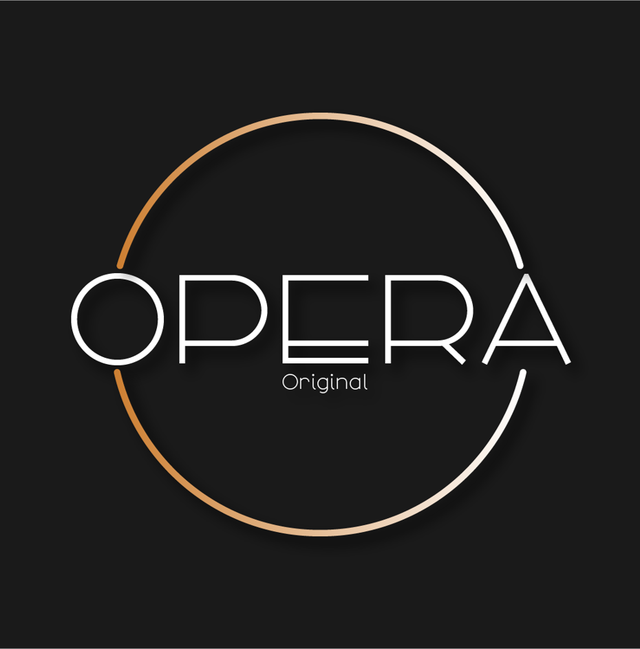
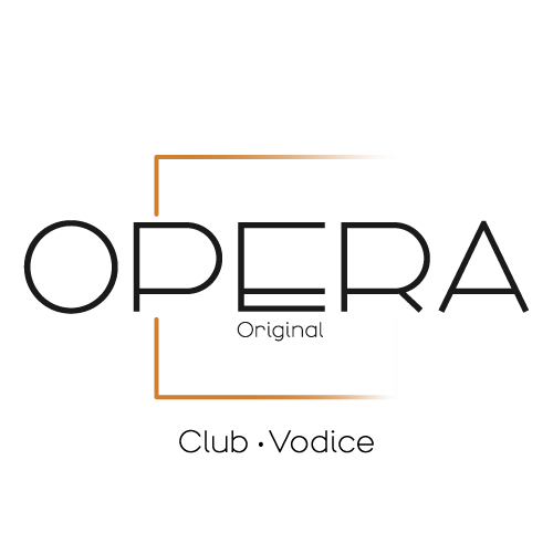
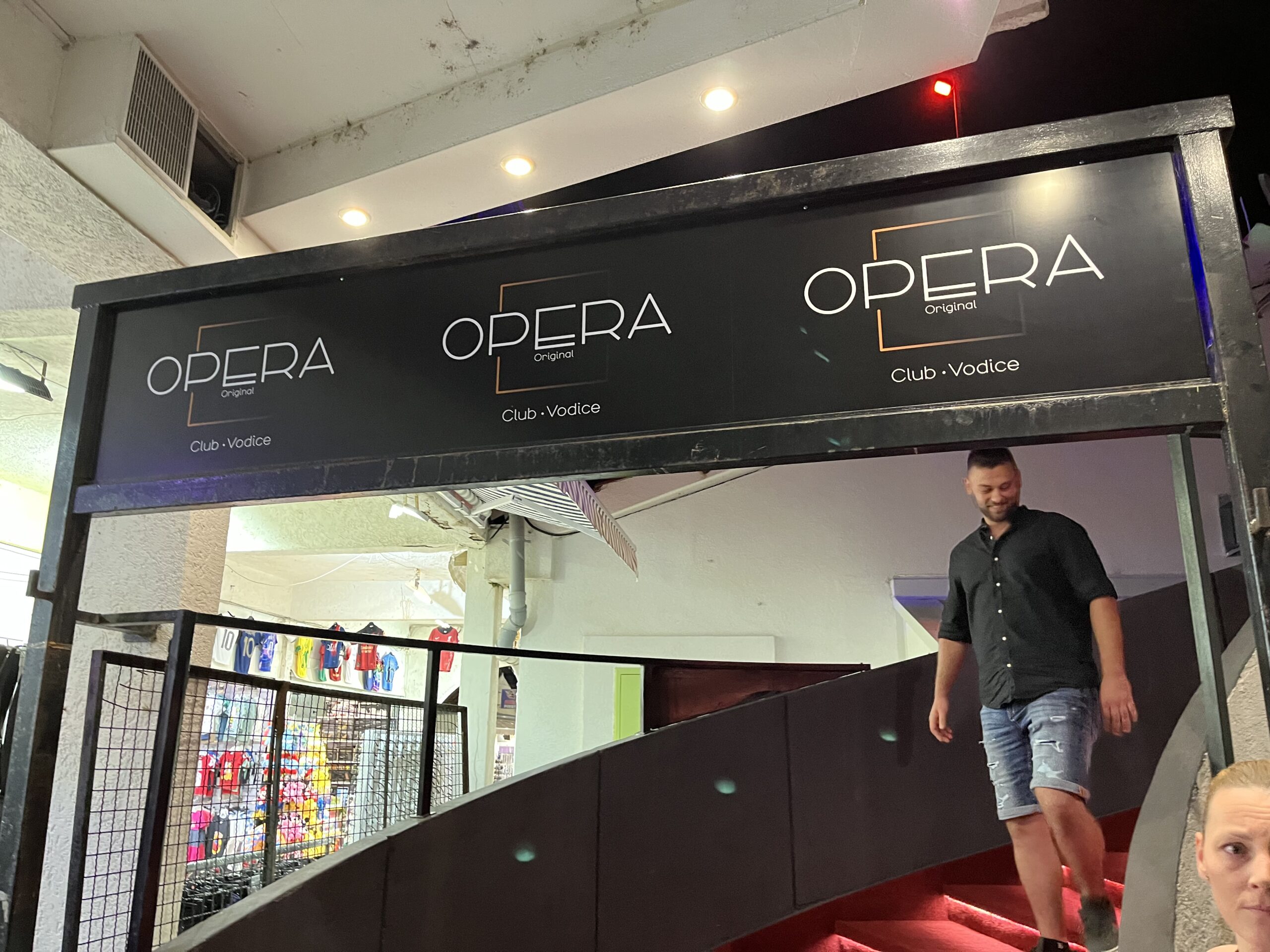
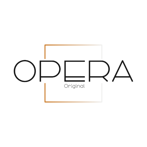
The brief was to create a functional, modern logo suitable for high-energy environments (videos, photos, and social media) while also being robust enough for physical applications (T-shirts, venue branding, and bottle labels). The client expressed a specific preference for a bronze color scheme to evoke a sense of premium nightlife.
Given the startup nature of the client, they required a comprehensive, “done-for-you” package to avoid the complexity of managing multiple vendors.
2. My Role & Responsibilities
02
As the Brand & Digital Lead, I was the sole point of contact responsible for the entire creative and technical ecosystem:
1. Brand Strategy & Design: Led the logo development, color palette refinement, and display typography selection.
2. Digital Infrastructure: Managed domain registration, web hosting, and email setup (3 addresses).
3. Web Development: Built a temporary one-page website using Bootstrap.
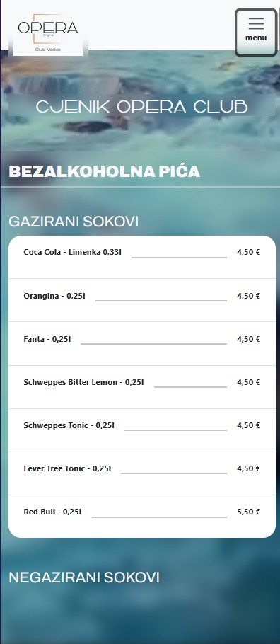
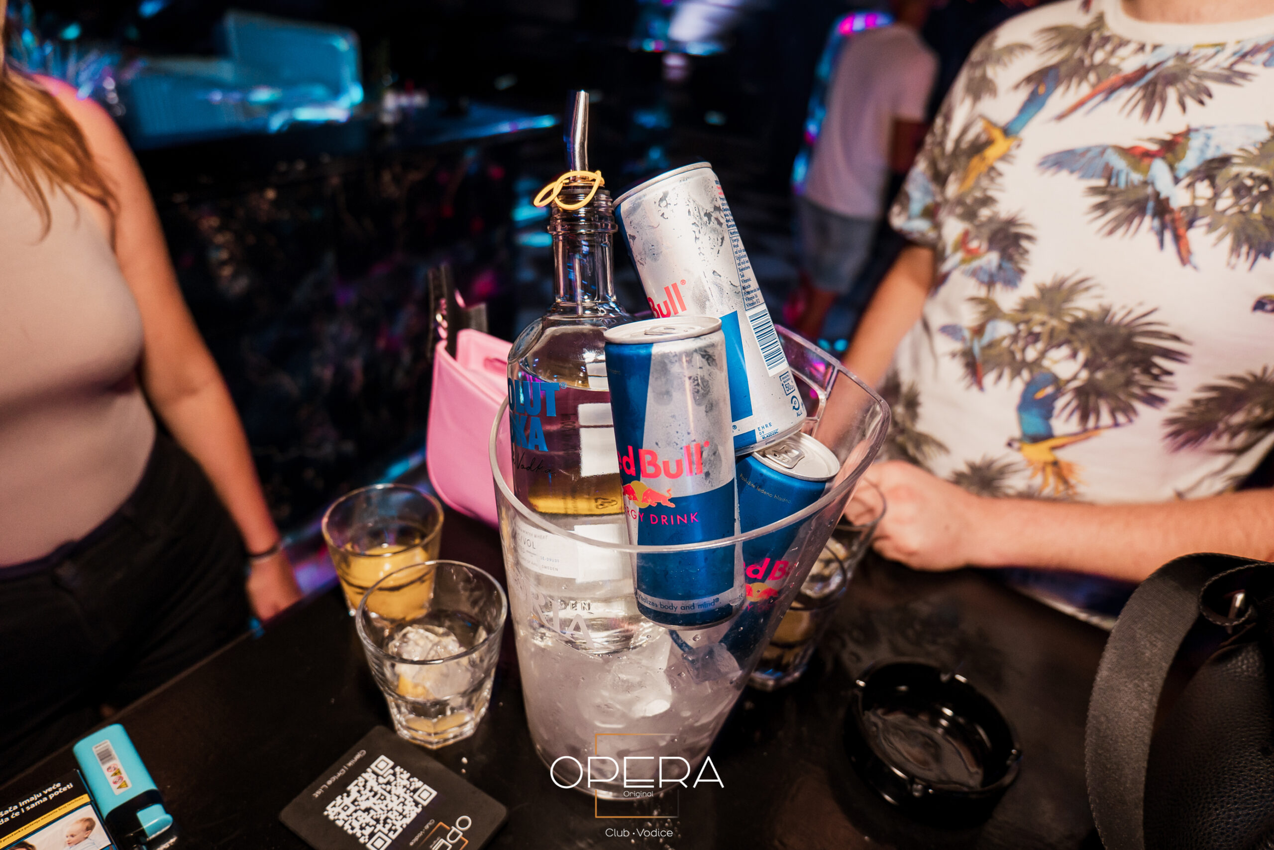
4. Production Design: Created a custom QR-code-based price list.
5. Social Media: Developed a design kit and initial social media assets (Facebook & Instagram).
6. Documentation: Wrote a comprehensive brand manual tailored for the local team.
Phase 1: Discovery & Concepting (10 Days)
The project kicked off with an intensive discovery phase to understand the nightclub's market position, target audience (tourists in Vodice), and operational goals.
- Initial Concepts: I presented six distinct logo concepts based on the “Opera” name and the requested bronze palette.
- Stakeholder Alignment: The client quickly identified a clear favorite among the six options, which confirmed their commitment to the bronze direction and allowed us to move rapidly into refinement. At this stage, we finalized the scope, which included not just the logo, but domain registration, hosting, email addresses, a one-page website, a QR price list, a brandy label, and social media kits.
1st Revision logo sketches
Phase 2: Development & Refinement (30 Days)
The project kicked off with an intensive discovery phase to understand the nightclub's market position, target audience (tourists in Vodice), and operational goals.
Visual Identity Refinement: I refined the chosen logo, finalized the specific bronze hex codes and print (CMYK) equivalents, and developed the display typography for headers to ensure the brand felt theatrical yet modern.
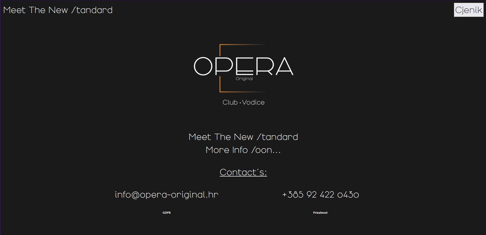
Website Build (Bootstrap): Using the text and information provided by the stakeholders, I built a clean, temporary one-page website. Designed to be lightweight and fast, it provided essential information (location, opening hours) while the client prepared for a full-scale site later.
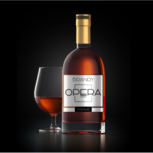
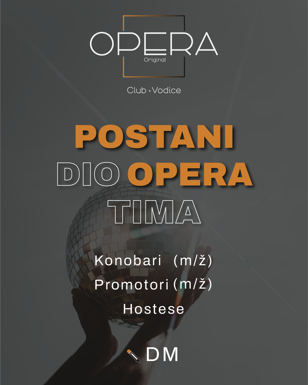
Print & Merchandise Mockups: I designed a custom brandy bottle label, ensuring the bronze logo popped against the bottle's color. Additionally, I created the first "Staff Wanted" social media post to help them kickstart their recruitment immediately.
QR Integration: At the client's request, I developed a QR-code price list, uploaded it to their new domain, and tested it to ensure seamless mobile access for patrons.
Phase 3: Delivery & Handover (10 Days)
The final phase focused on packaging the assets for both immediate launch and long-term maintenance.
Comprehensive Logo Package: I compiled a complete set of logo files, including digital (RGB), print-ready (CMYK), and scalable vector formats for large-format printing (venue walls, banners).
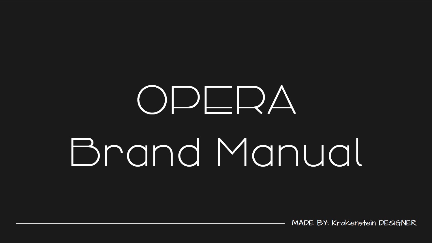
Croatian Brand Manual: Recognizing that the company is based in Croatia, I made a strategic decision to write the brand manual entirely in Croatian. This ensured no translation errors and guaranteed that the local marketing and operations staff could easily understand and apply the guidelines without external help.
Final Delivery: I handed over the fully functional one-page website, the live QR price list, the social media design kit, and the printed label specifications.
1. Single-Vendor Efficiency: By bundling domain registration, hosting, design, and print preparation into one package, the client saved significant time and money that would have otherwise been spent coordinating between separate agencies.
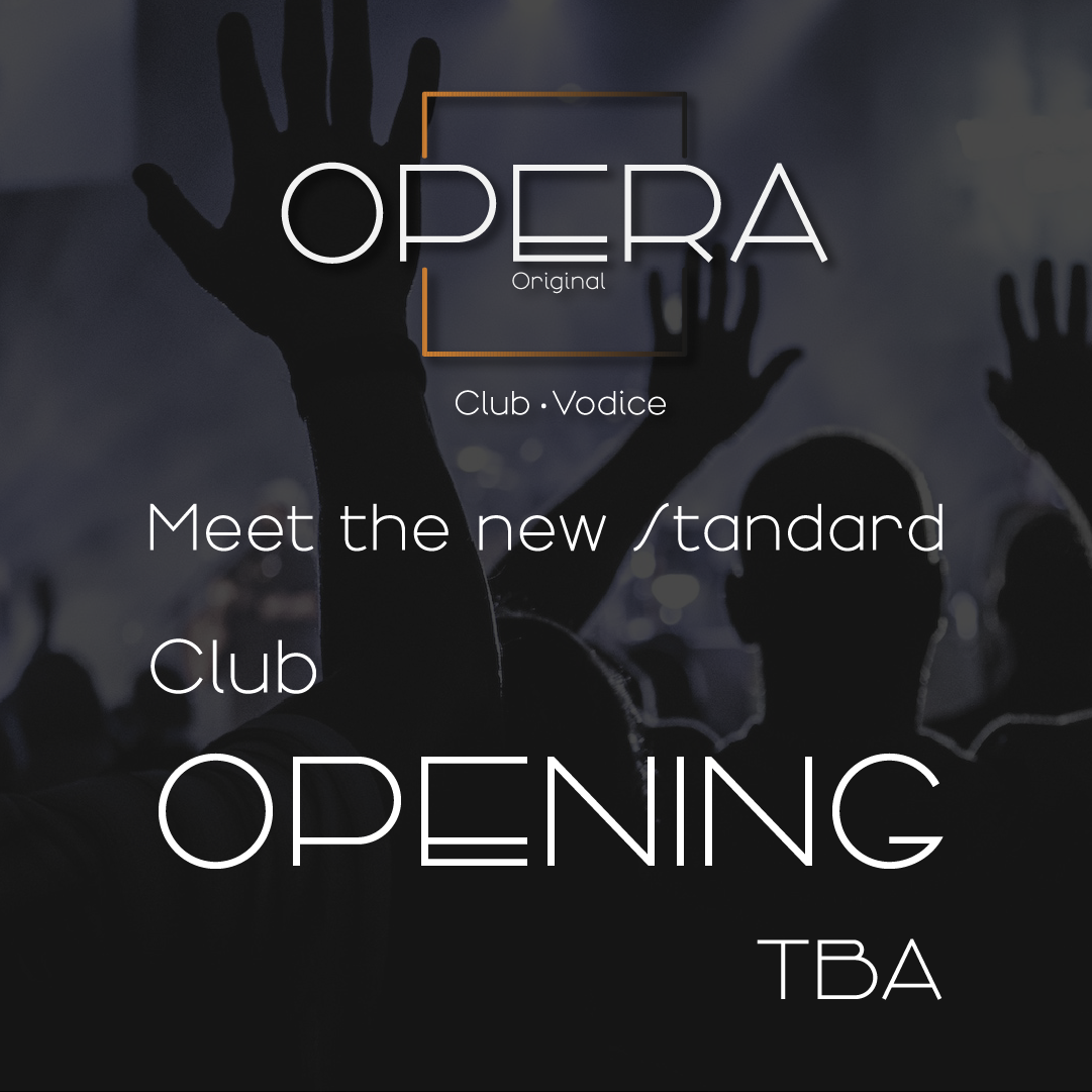
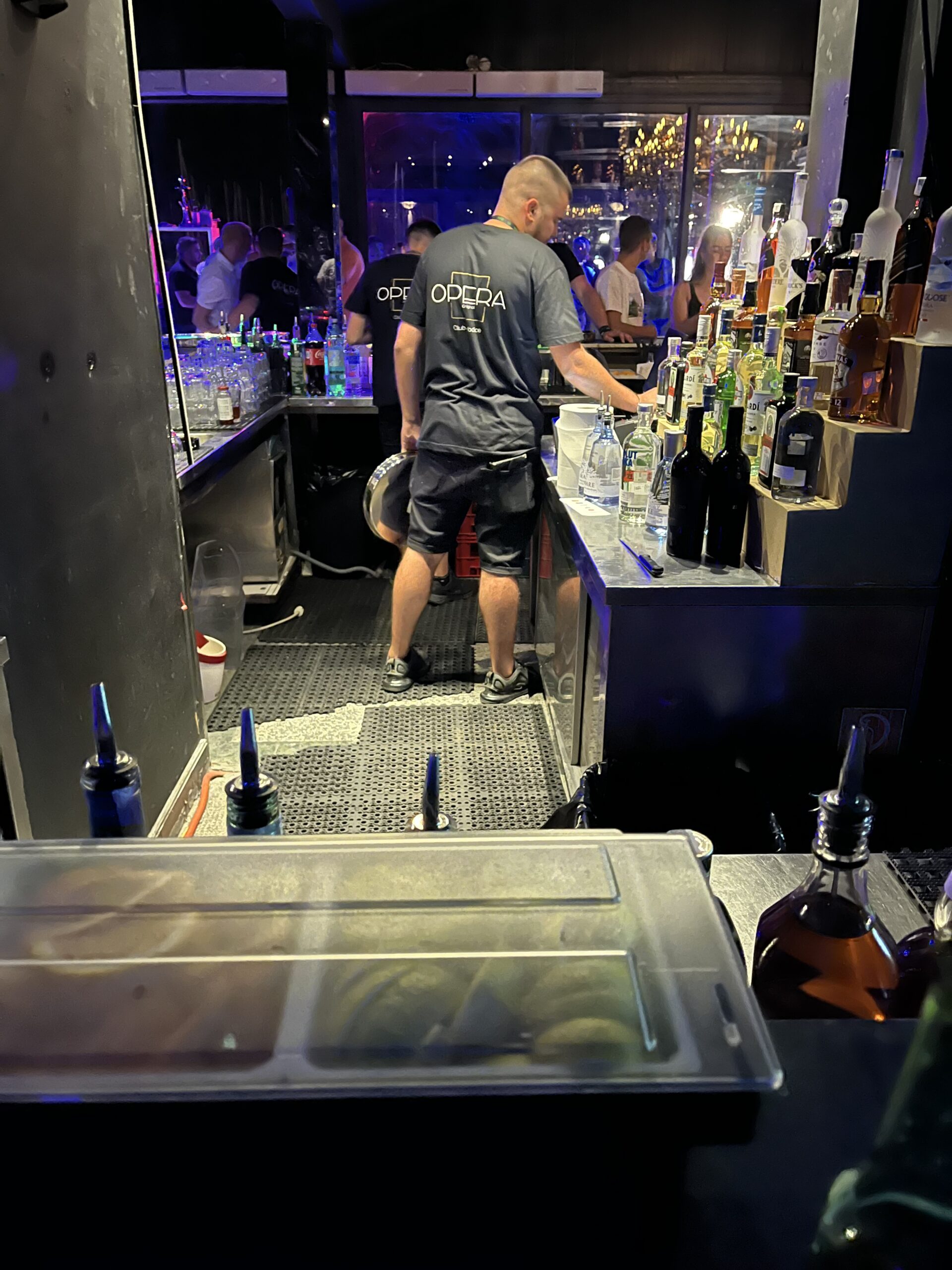
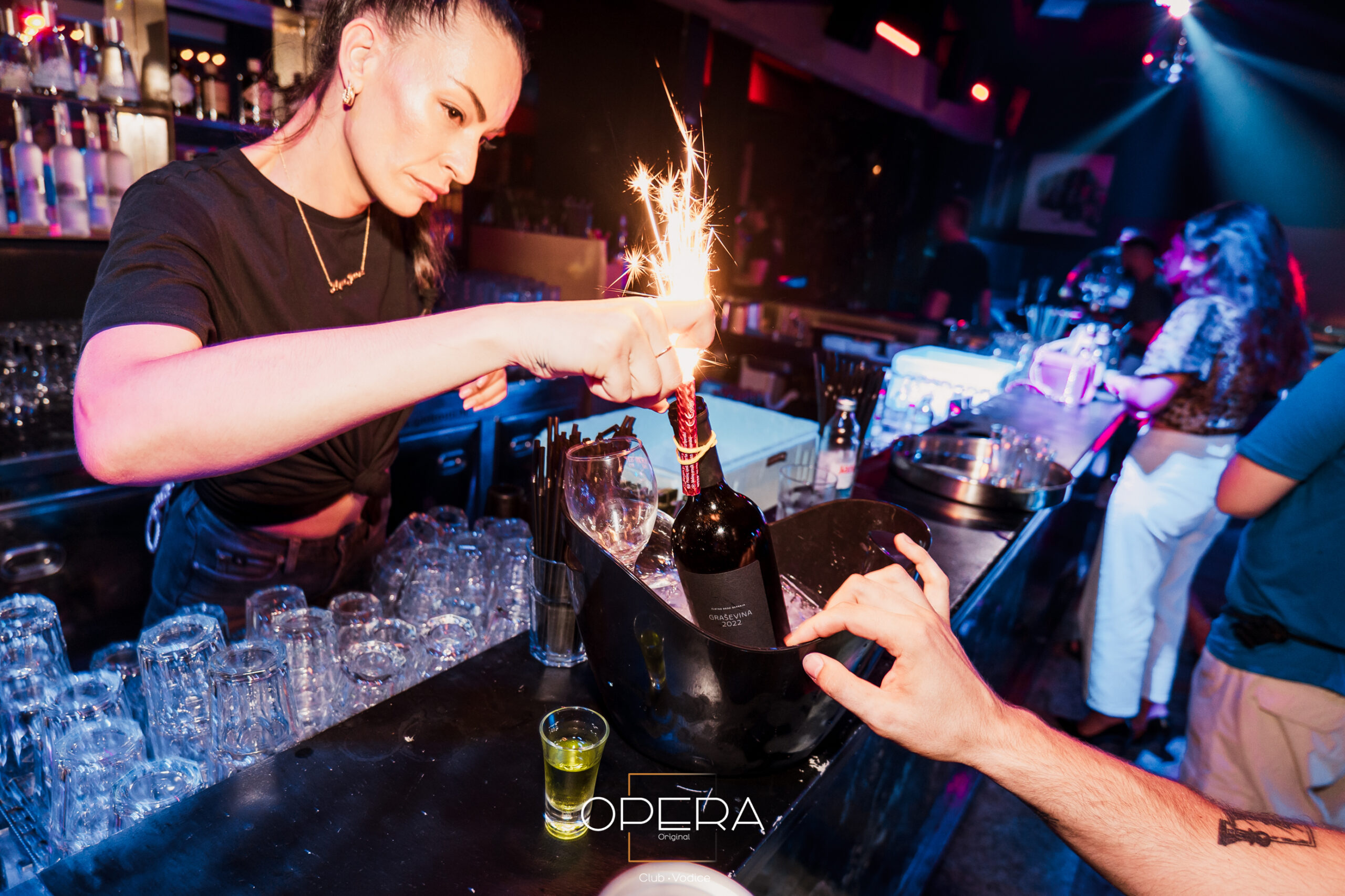
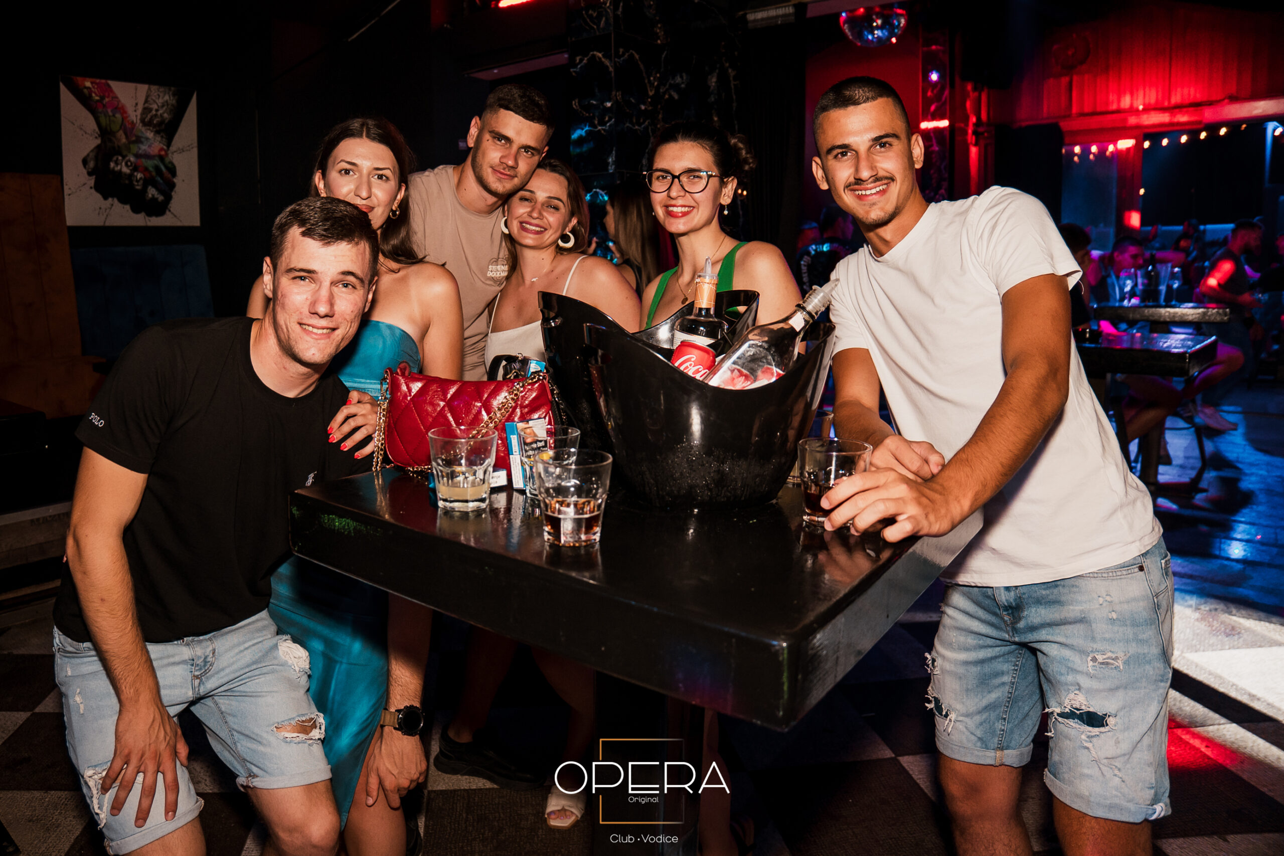
2. Versatile Brand Application: The bronze-centric logo was successfully engineered to maintain its visual integrity across vastly different mediums—from glowing smartphone screens and Instagram feeds to physical T-shirts and glass brandy bottles.
3. Immediate Operational Readiness: The "Staff Wanted" post and QR price list allowed the startup to begin recruitment and customer service trials immediately, well before the physical venue construction was fully completed.
4. Localized Sustainability: The Croatian brand manual empowers the client's local team to produce new marketing materials independently, ensuring long-term brand consistency without requiring ongoing external consulting.
Key Takeaways
Localization is Critical: Writing the manual in Croatian wasn't just a nice gesture—it was a strategic decision that removed friction and ensured the brand guidelines would actually be used by the team on the ground.
Design for Versatility: A nightclub logo must look good in the dark on a neon sign, on a tiny Instagram avatar, and on a physical bottle. Ensuring the bronze palette and vector shapes worked across these extremes required rigorous testing during the refinement phase.
Simplify the Startup Journey: Startups often don't know what they need beyond "a logo." Offering a structured, turnkey package (including domain, hosting, emails, and QR codes) provided immense value by solving problems they hadn't even anticipated yet.
Speed to Market: The 50-day timeline from concept to delivery gave the client a significant head start, allowing them to build pre-launch buzz and recruit staff well before the busy Vodice tourist season began.