1. The Challenge & Context
01
When I joined DIMOCO in 2023, the international payment company was operating in a state of digital fragmentation. While the brand had a distinct visual identity—a dark theme with a limited 3-color palette designed to stand out from competitors—the execution across channels was inconsistent and technically strained.
The company was facing three major hurdles:
- Technical Fragmentation: The website was a bulky WordPress multisite network running on an undersized shared server, bundling approximately ten distinct domains. This configuration caused slow load times and made agile updates nearly impossible.
- Inconsistent Brand Execution: Beyond the main brand, DIMOCO ran “ZepH”—a joint initiative with German mobile operators promoting Carrier Billing—which operated almost as a separate entity with its own expo requirements.
- Rapid Physical Expansion: DIMOCO was actively exhibiting at payment conferences and expos across Europe, requiring fresh booth designs, while simultaneously needing to elevate its B2B social media presence on LinkedIn.
2. My Role & Responsibilities
02
As the Graphic & Web Design Manager, I was the primary owner of DIMOCO’s visual and digital execution. My responsibilities spanned technical strategy, design leadership, and cross-functional collaboration:
- Technical Migration: Led the strategy to migrate from shared hosting to a dedicated server and dismantled the multisite configuration.
- UX/UI Redesign: Redesigned the website architecture for improved usability and modern SEO standards.
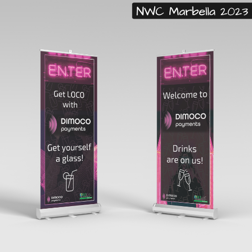
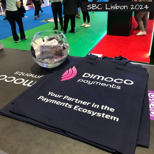
- Expo & Print Design: Managed the design and production of booth layouts, roll-ups, flyers, and giveaways for both the DIMOCO and ZepH brands across European expos.
- Internal Enablement: Built sustainable workflows, including Photoshop templates for social media and a completely rewritten brand manual to ensure consistency.
Phase 1: Discovery & Initial Strategy
The project began with a deep-dive discovery phase. I immersed myself in the complexities of the payment industry, mapped the specific needs of various internal departments regarding the website, and audited the ten domains slated for integration.
Key Insights:
- The IT department was managing the backend separately from Corporate Communications, creating a bottleneck for updates.
- The ZepH sub-brand required specialized attention, operating in a different market (Germany) with its own expo footprint and target audience.
Phase 2: Website Overhaul & Technical Migration
The Infrastructure Revolution
After auditing the website, I identified significant design flaws and severe performance issues tied to the WordPress multisite setup on the undersized shared server. I presented these findings to stakeholders and made a strategic recommendation: move the website, backend, and related domains under the Corporate Communication team’s control for agile, streamlined updates.
We successfully:
- Migrated to a Dedicated Server: This resolved latency issues and allowed for future scalability.
- Eliminated the Multisite: We dismantled the complex multisite configuration, selected a primary domain, and began a clean migration.
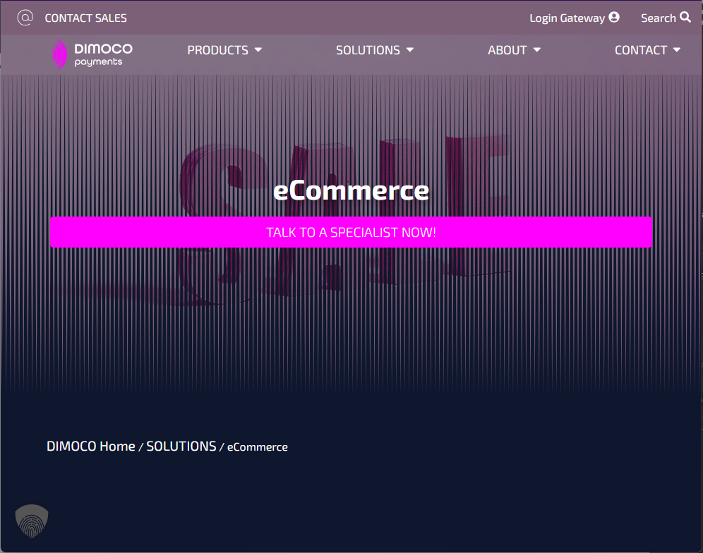
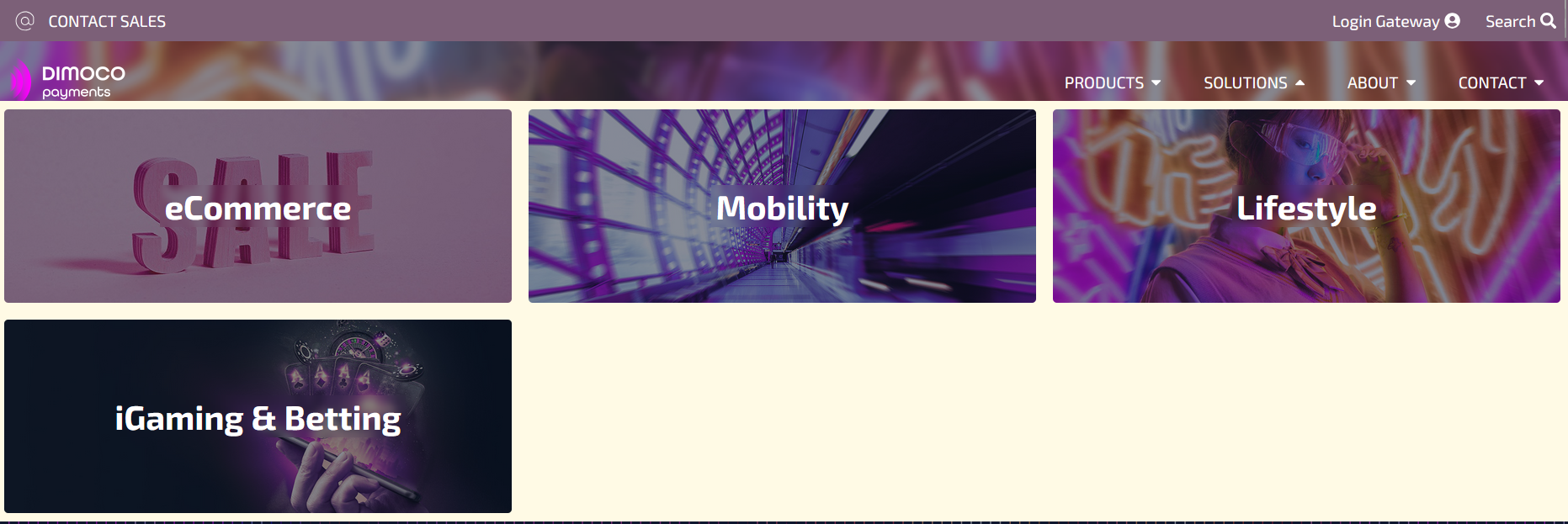
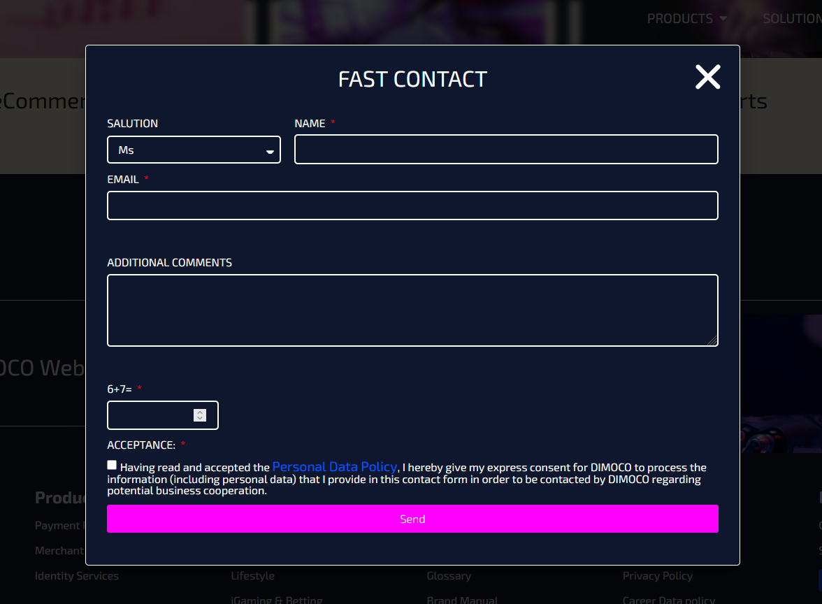
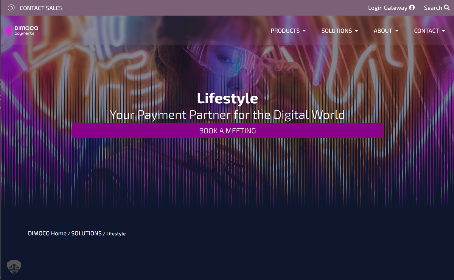
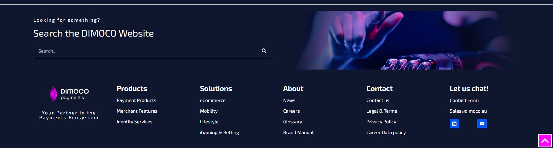
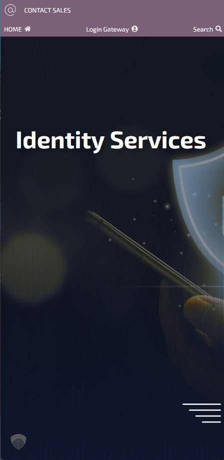
- Restructured UX: The new site was organized into four main sections for logical navigation. I prioritized user experience by making contact buttons visible throughout the scrolling experience and implementing strategic CTAs that triggered a streamlined pop-up form. A comprehensive footer (containing all pages and a search feature) was added, alongside a search bar positioned above the navigation for immediate visibility.
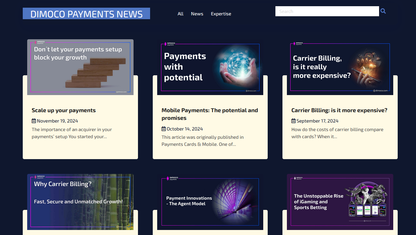
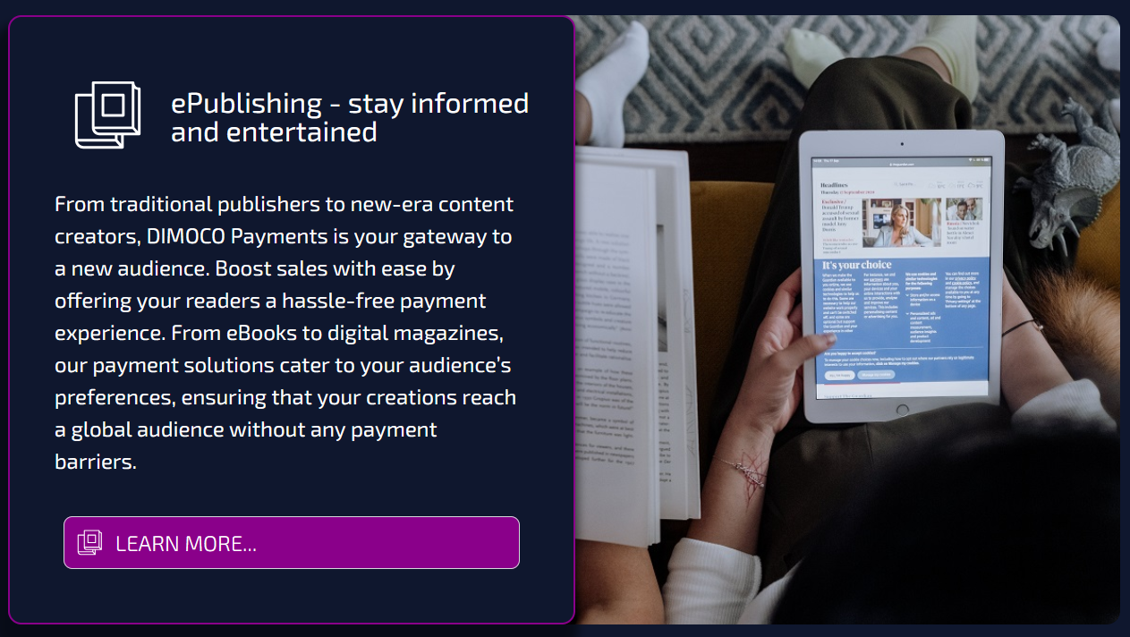
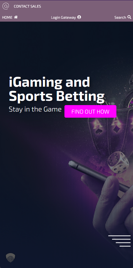
Dimoco website redesign 2023
SEO Strategy
I introduced a modern SEO approach, integrating best practices into the new structure. To monitor performance, I introduced the team to “SE Ranking” software, leveraging my prior experience to track keyword strategy and optimize content across pages and news postings.
Phase 3: Print, Expo & Social Media Design
DIMOCO Brand Expos
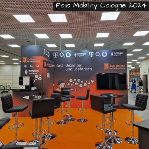
For the main DIMOCO booth, I designed a straightforward yet striking presence featuring two walls and a counter. To maximize lead generation, I implemented a dynamic QR code on the counter that directed users to a dedicated landing page for meeting bookings—effectively bridging the physical and digital experiences.
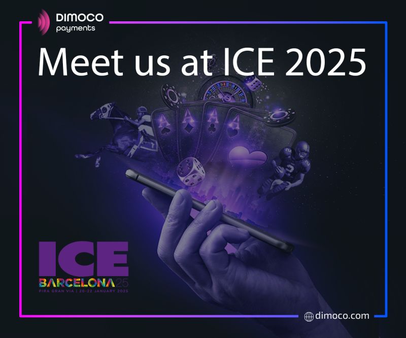
Dimoco Expo (print) design 2023 - 2024
ZepH Brand Expos
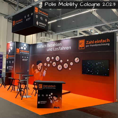
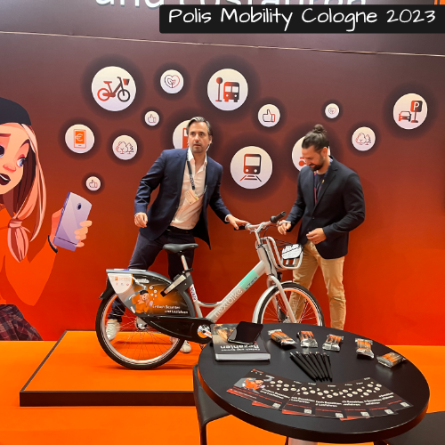
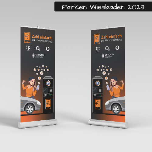
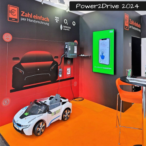
The joint initiative with German operators presented a more complex challenge. Unlike the standard DIMOCO booth, ZepH required different setups based on available expo space. For the e-charging expo, I created a completely unique custom booth design. For the e-mobility expo, I updated the existing mascot (a girl visually representing “all mobility options on her phone”) by meticulously retracing and aligning it with the ZepH brand guidelines to ensure visual impact.
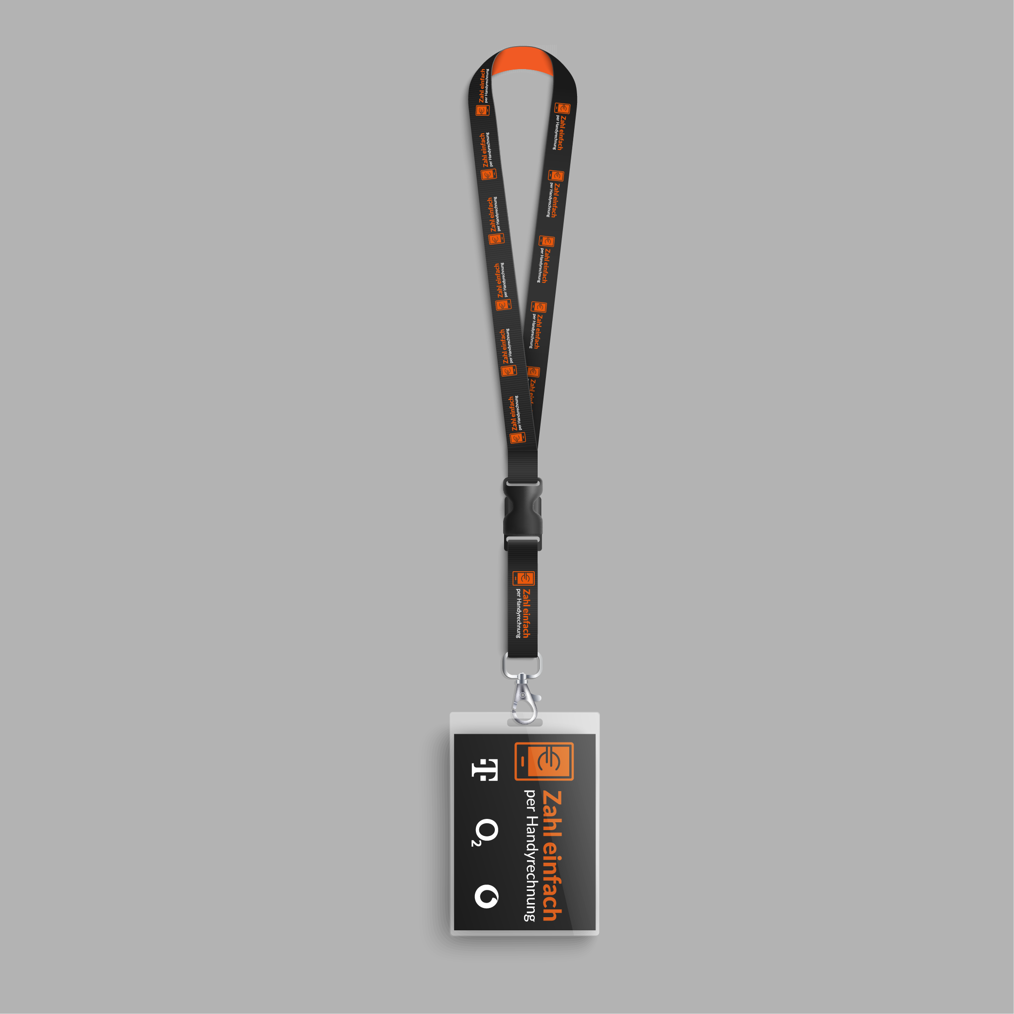
ZepH Expo (print) design 2023 - 2024
Sustainable Social Media Workflow
To manage the company’s strong LinkedIn presence, I initially designed posts in Adobe Illustrator. However, to ensure consistency and scalability, I transitioned to creating Photoshop templates, enabling colleagues to easily update images and text without requiring a designer’s intervention for every post.
DIMOCO Social media postings 2023
Phase 4: Delivery & Brand Governance
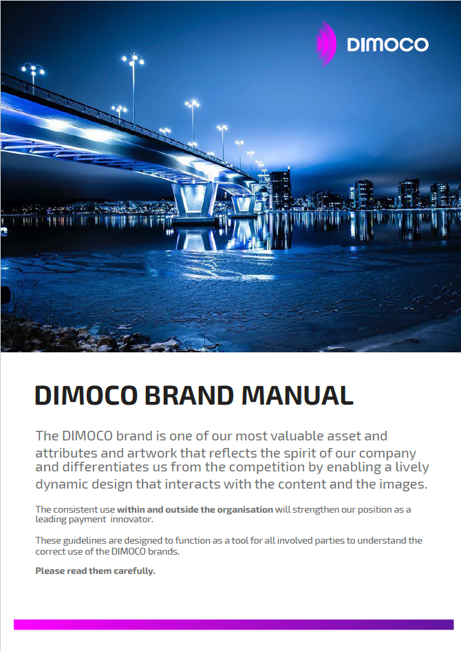
To cement the changes, I undertook a comprehensive rewrite of the Brand Manual. The goal was to move from a complex document to a highly usable, concise guide.
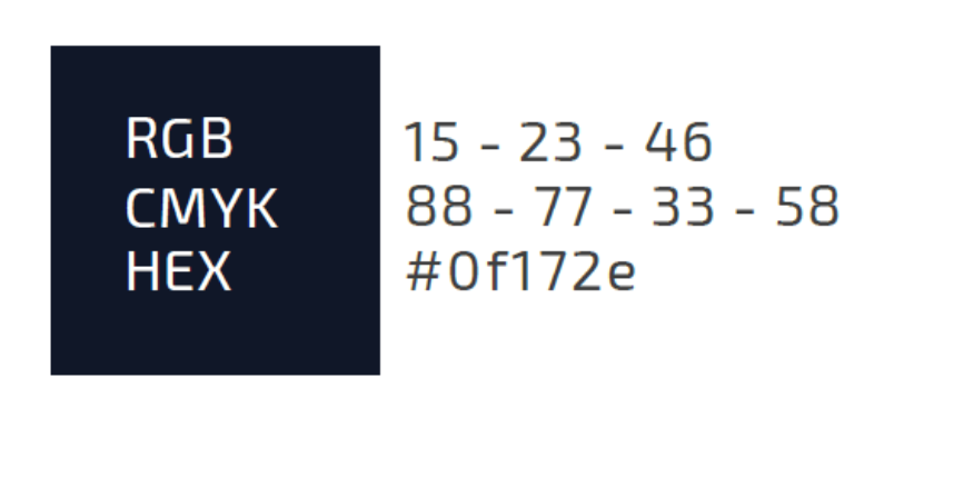
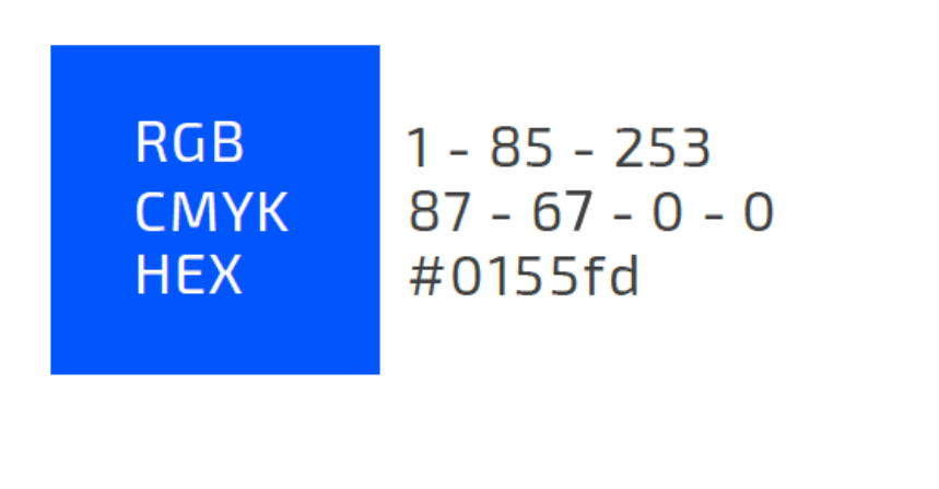
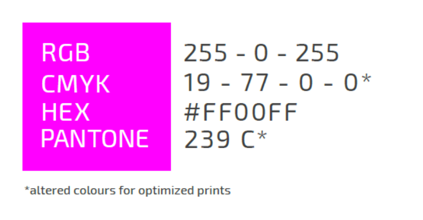
3 colors of the corporate design
UX-Focused Documentation:
I designed the final PDF to be a model of user experience. It featured a clickable table of contents and a “back to content” button on every single page. This significantly enhanced navigation for internal stakeholders, ensuring that even non-designers could quickly find the rules governing color, typography, and application.
1. Web Performance: Migrating to a dedicated server and dismantling the multisite significantly improved page load times and overall site stability.
2. Operational Agility: Transferring domain and backend control to Corporate Communications allowed for faster, more autonomous updates without relying on IT for every change.
3. Lead Generation: The dynamic QR code integration on expo booths successfully streamlined the process for leads to book meetings on-site.
4. Brand Versatility: Successfully managed two distinct brand identities (DIMOCO and ZepH) simultaneously, adapting designs to fit varied expo dimensions and industry focuses (e-charging vs. e-mobility).
5. Internal Efficiency: The creation of Photoshop templates and the highly interactive PDF Brand Manual reduced the time staff spent on design queries and empowered them to produce on-brand collateral independently.
Key Takeaways
Infrastructure First: A beautiful design is useless without stable architecture. Addressing the server and multisite issues early was the non-negotiable foundation for future success (which later enabled the 2025 rebrand).
Bridging Departments: Acting as the liaison between Corporate Communications and IT was critical to breaking down silos and achieving a unified technical strategy.
Design for Maintenance: Creating templates (both for social media and physical booth elements) ensured that the 2023 overhaul wasn't just a one-time fix, but a sustainable system.
Treat Documentation as UX: Redesigning the Brand Manual with clickable navigation wasn't just about providing rules; it was about respecting the user's time and ensuring the guidelines were actually used.