Krakenstein Designer - Mind the user

Krakenstein Back to top icon- black
Back to top

Opera

Project

A Croatia-based event management startup enlisted my expertise to develop a corporate design for their project—a nightclub located in the popular tourist destination of Vodice. With the name already established, they sought a functional, modern logo suitable for digital applications such as photos and videos, as well as for print materials including T-shirts and venue branding.

Role

Creative director

Phase 1 -Discovery-

01

DURATION: 10 DAYS

The project began with a discovery phase, where I gathered insights into the company’s goals and requirements.

The client had already selected a name and expressed a preference for a bronze color scheme.

After reviewing several options, they chose a streamlined corporate design package.

1st Revision logo sketches

Krakenstein squere logo white on black

This package included a logo for both digital and print use, display typography for headers, domain registration, web hosting, three email addresses with the company’s domain, a temporary one-page website with essential information, a QR-based price list hosted on their site, a custom brandy bottle label, and social media content for Facebook and Instagram.

From the initial round of six logo concepts, the stakeholders quickly identified their preferred design, confirming the decision to proceed with the bronze color palette.

Phase 2 -Development-

02

DURATION: 30 DAYS

In the second phase, I refined the selected logo concept, finalized the color scheme, and developed the header typography. I also created a mockup for the custom brandy label, assembled a social media design kit, and produced the first “Staff Wanted” post.

For the website, I used Bootstrap to build a one-page site featuring the information provided by the stakeholders.

Logo, postings & Branding materials

Krakenstein squere logo white on black

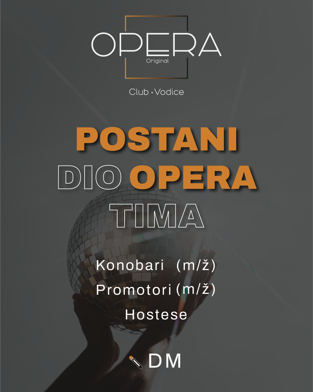
These refined materials were presented to the client, who was very pleased with the results.

Opera mobile price list
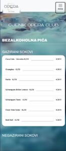
At their request, I also created a QR-code price list, which was uploaded to their domain, paving the way for the final phase.

Phase 3 -Delivery-

03

DURATION: 10 DAYS

The third phase focused on preparing and delivering the final assets.

I compiled a comprehensive logo package with digital, print-ready (CMYK), and vector files.

Additionally, I produced a brand manual to facilitate future print or digital use, and delivered the completed one-page website and QR price list.

The design in action

Krakenstein squere logo white on black

Since the company is based in Croatia, the brand manual was prepared in Croatian to ensure clearer communication.

Opera Original Brand manual header
Click to see the brand manual in a new window in PDF.

Project archive

With over 100 completed projects in recent years, it’s impossible to showcase every creative journey here.

In this archive carousel, you’ll find a diverse sample of my work in visual design, UX design, corporate branding, web development, and print design.

Each project highlights my experience and versatility as a designer. For a deeper look or to discuss a specific project, feel free to get in touch—there’s much more to share beyond what’s displayed here.