1. The Challenge & Context
01
A Croatia-based event management startup approached me to build their visual identity from the ground up. They needed a brand that communicated professionalism, energy, and reliability—essential qualities for winning clients in the competitive events industry.The brief was specific:
- A functional, modern logo available in both written (wordmark) and icon-based (symbol) formats to maximize versatility.
- Bold typography for headers to create a strong visual impact.
- A selection of physical branding materials to support their launch, including business cards, T-shirts, paper bags, and a company sign.
The client was a lean startup operating in Croatia, meaning the solution needed to be practical, easy to implement, and immediately usable by their local team.
2. My Role & Responsibilities
02
As the Brand & Digital Lead, I led the entire branding journey from concept to delivery:
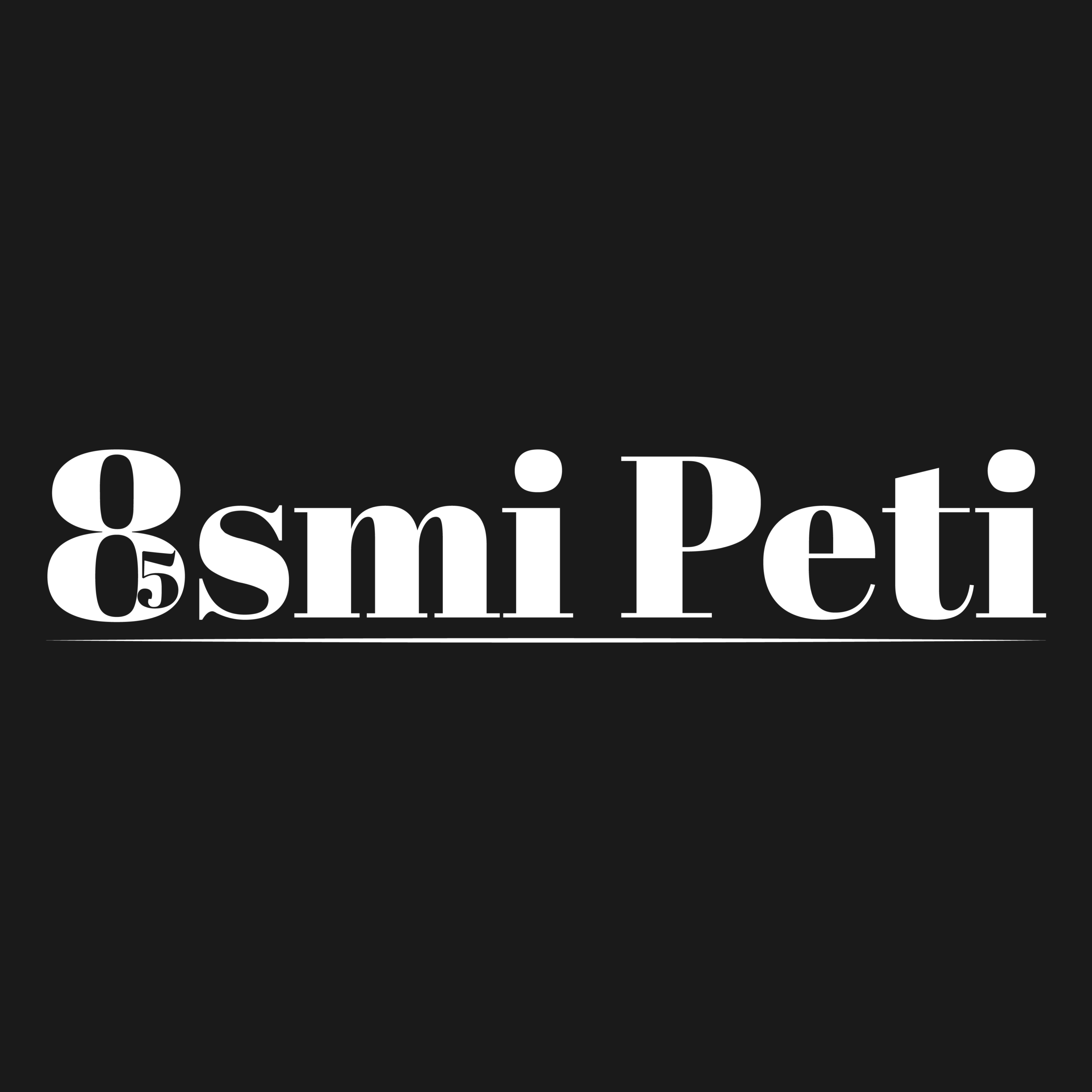
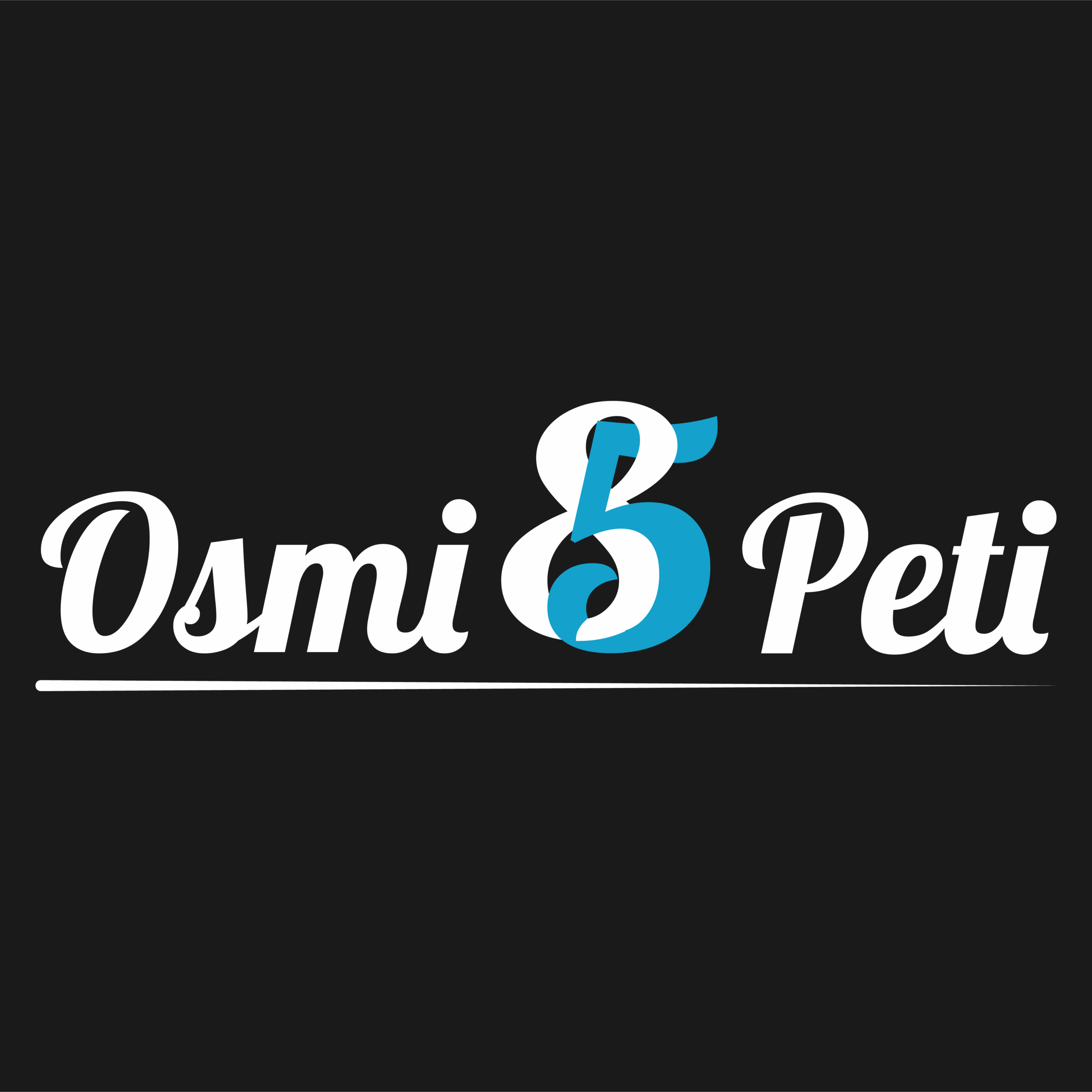
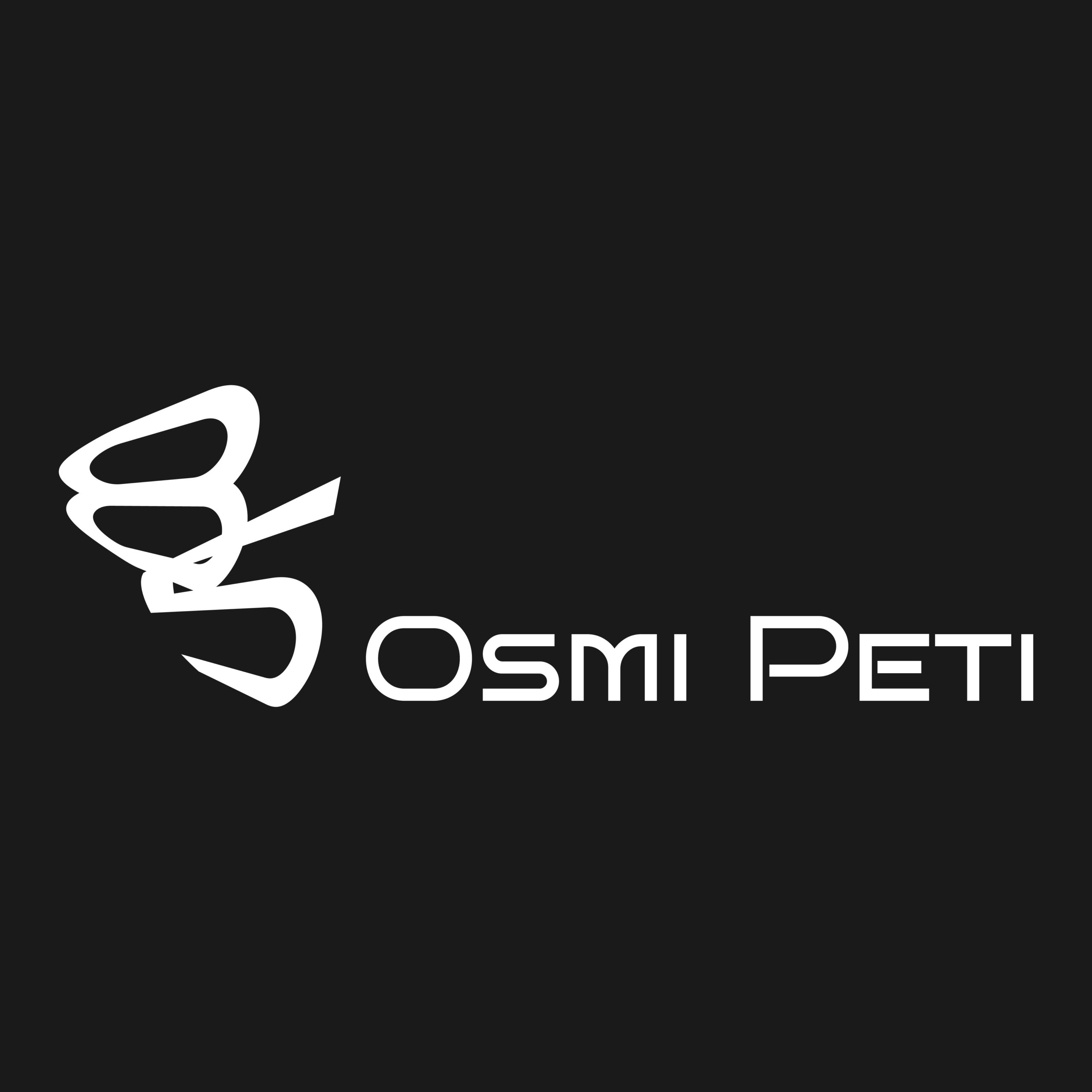
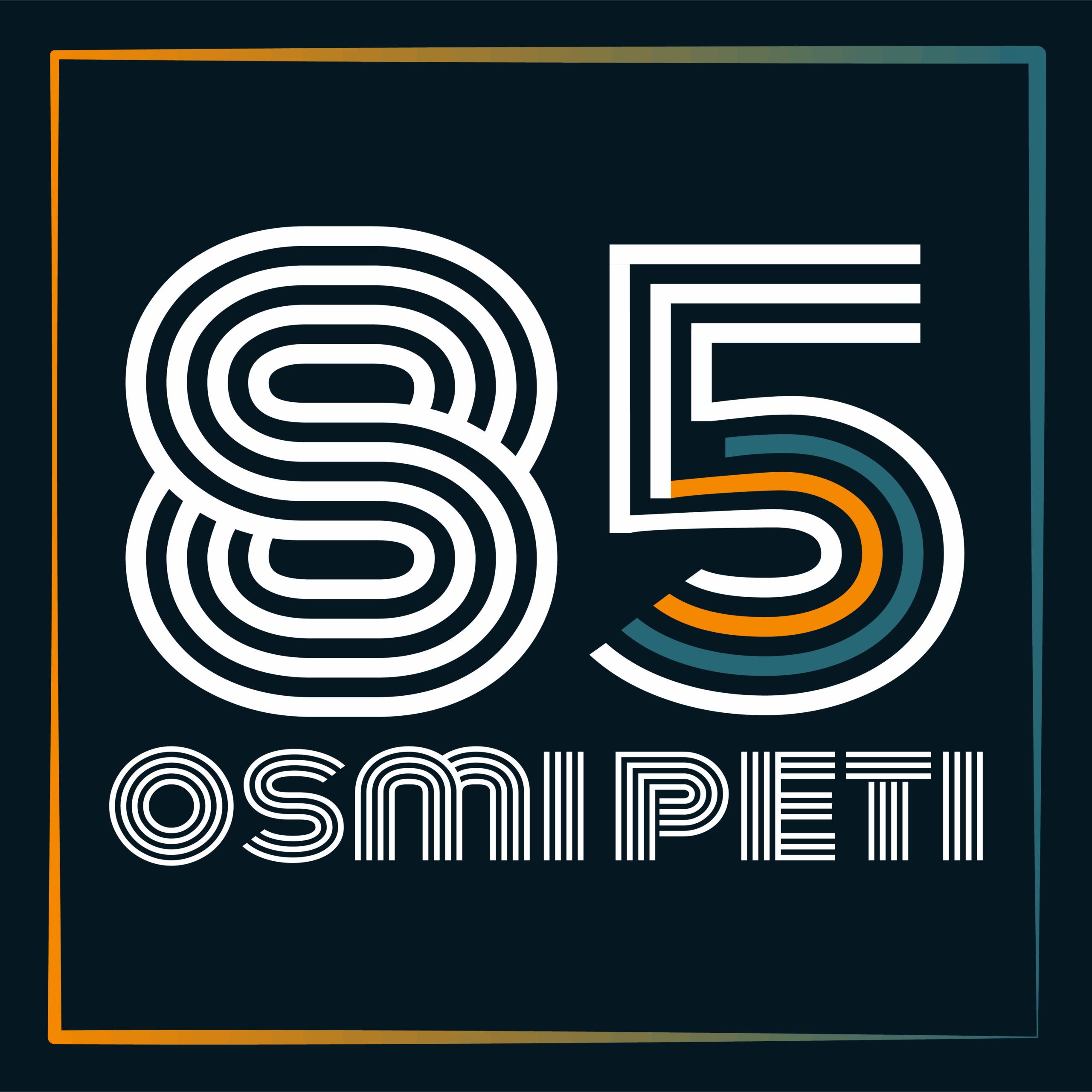
1. Brand Ideation: Developed four distinct logo concepts and guided the client through the selection process.
2.Logo Design & Refinement: Created both horizontal (wordmark) and vertical (icon-only) versions of the chosen logo.
3. Typography Selection: Sourced and applied bold display typography to reinforce the brand's confident personality.
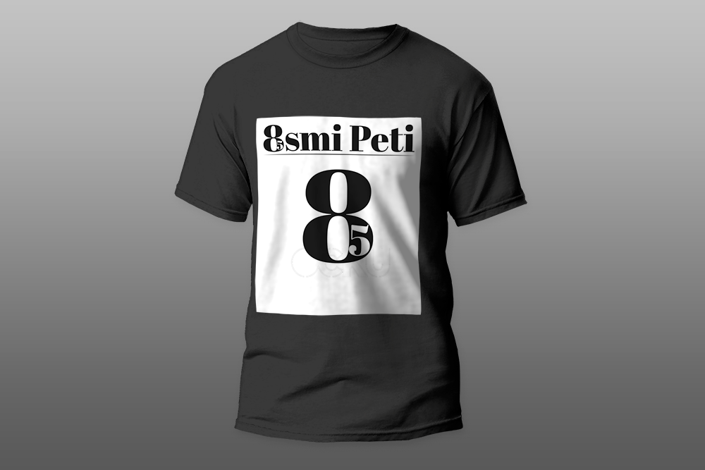
4. Collateral Design: Designed mockups and production-ready files for business cards, T-shirts, paper bags, and a company sign.
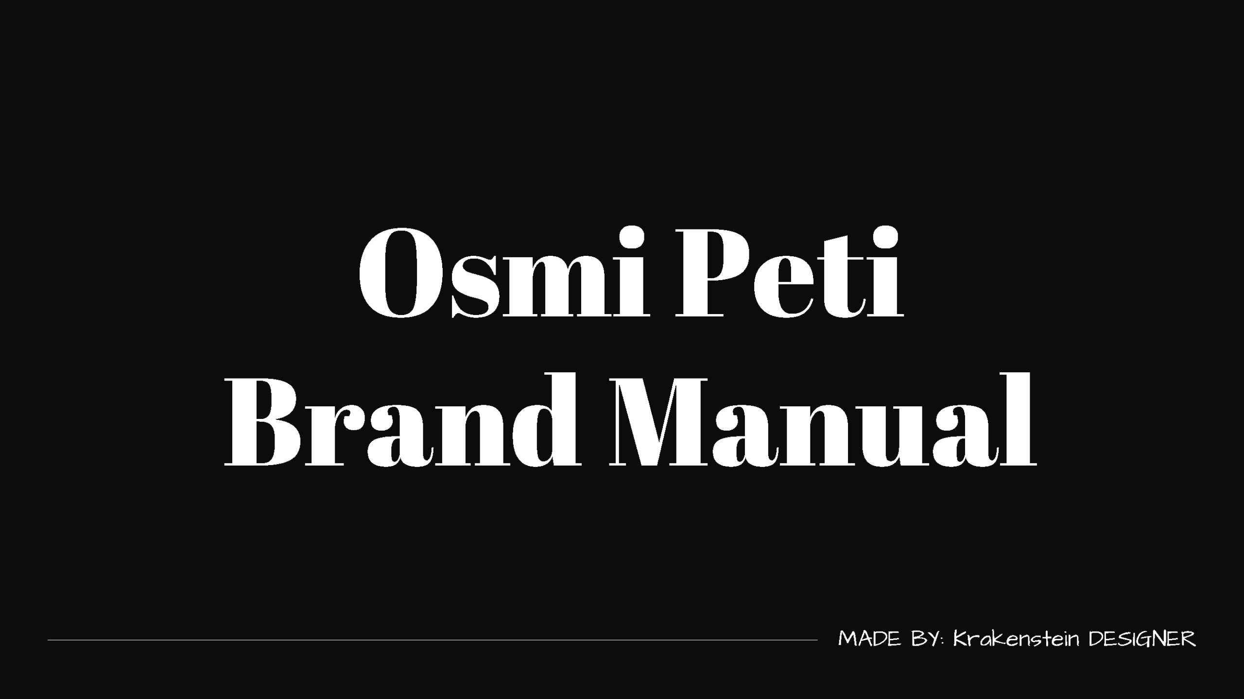
5. Documentation: Wrote a comprehensive brand manual in Croatian to ensure long-term internal usability.
Phase 1: Discovery & Ideation (5 Days)
The project began with a rapid discovery phase to understand the startup's positioning, target audience, and practical needs within the Croatian event management sector.
Concept Exploration: I developed and presented four distinct logo concepts, exploring different visual metaphors for event management (movement, coordination, celebration).
1st Revision logo sketches
Immediate Alignment: The stakeholder instantly favored the first concept. Recognizing the decisive feedback, we locked in the direction immediately and confirmed a black-and-white color scheme—a strategic choice that ensured timelessness, high contrast for signage, and cost-effective printing across various materials.
Scope Finalization: At this stage, we agreed on the final package, which included the dual-format logo, bold header typography, business cards, T-shirts, paper bags, and a company sign.
Phase 2: Development & Refinement (20 Days)
With the concept approved, I moved into the detailed execution phase.
Dual-Format Logo Refinement: I refined the chosen concept into two distinct versions to ensure maximum flexibility:
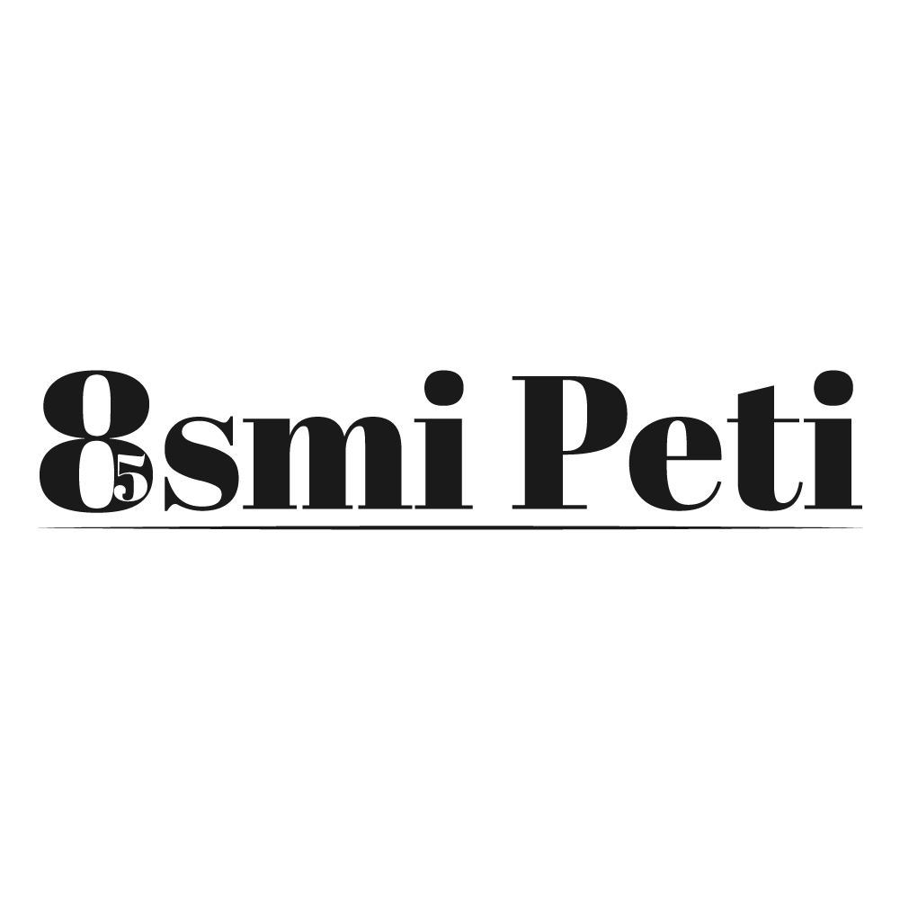
-Horizontal (Written): A full wordmark for formal documents, website headers, and standard business applications.
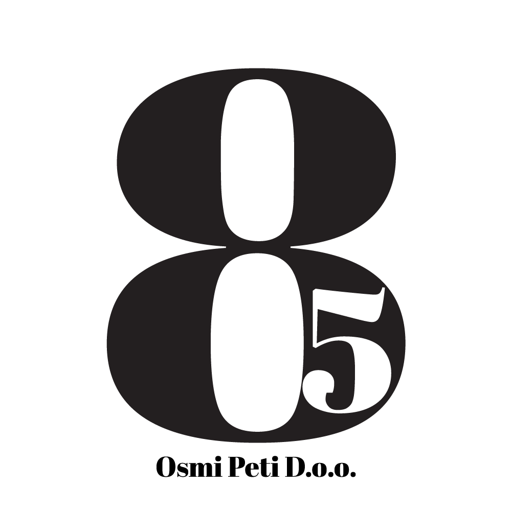
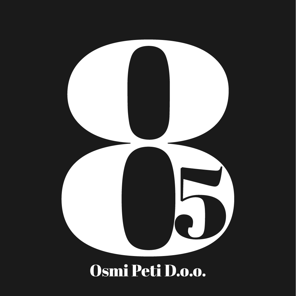
-Vertical (Icon-Based): A standalone graphic symbol stripped of text. This format was designed for social media avatars, T-shirt front prints, and small-scale applications where readability at a distance was critical.
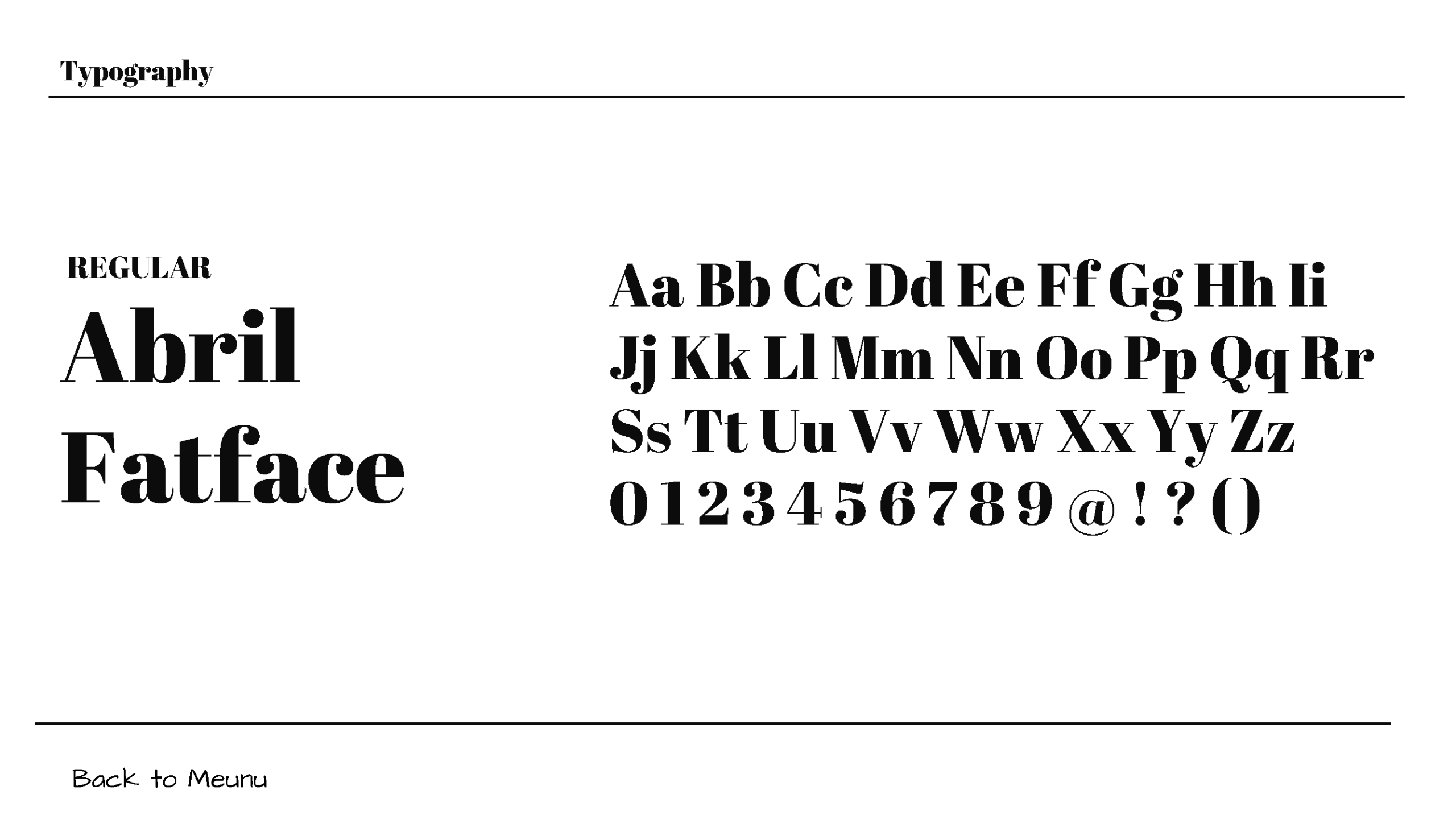
Typography: Selected and applied bold display typography for headers to match the confident, energetic tone of a startup.
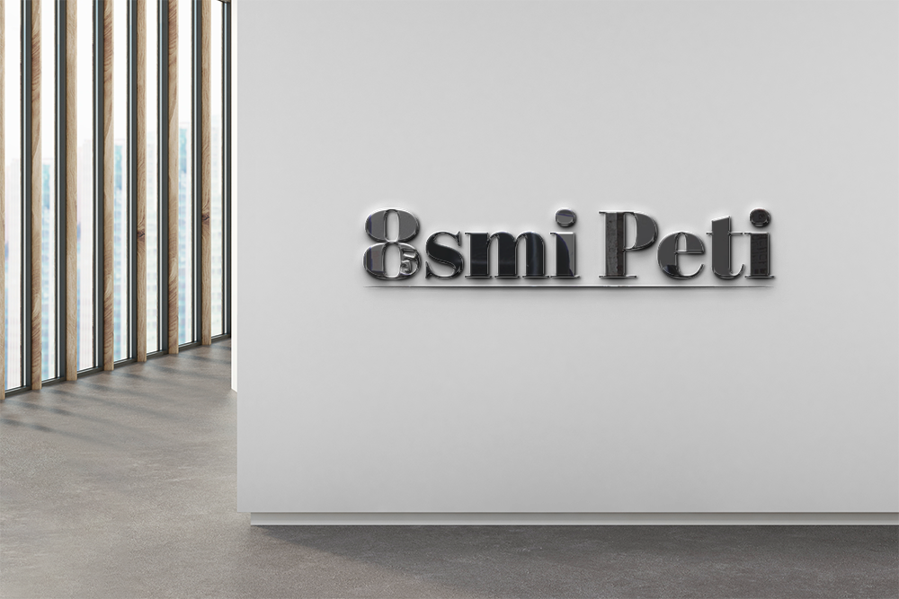
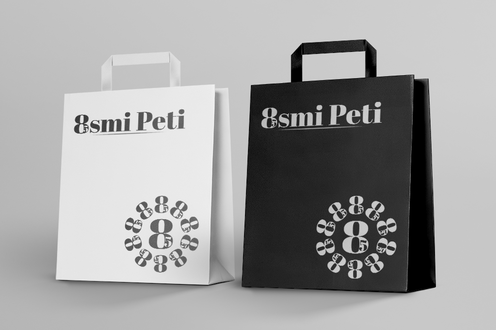
Collateral Mockups: I designed realistic mockups for the business cards (featuring the dual logos appropriately), T-shirts (testing the icon's scale and placement), premium paper bags, and a prominent company sign. These mockups helped the client visualize the brand in the real world before committing to production.
Phase 3: Delivery & Handover (10 Days)
With the concept approved, I moved into the detailed execution phase.
Comprehensive Logo Package: I compiled a complete set of files, including:
Digital (RGB): For web, social media, and digital presentations.
Print-Ready (CMYK): For high-quality offset and digital printing.
Vector Formats (SVG/AI/EPS): For large-format applications like the company sign and any future scaling needs.
Croatian Brand Manual: Recognizing the client is based in Croatia, I wrote the entire brand manual in Croatian. This empowered the local team to share the guidelines with any local printer or designer without language barriers, ensuring the brand would remain consistent even as they grew.
1. Launch Readiness: The startup received a turnkey brand system within 35 days, allowing them to order business cards, print T-shirts for staff, and install their company sign immediately upon opening.
2. Strategic Versatility: The dual-format logo system proved invaluable. The icon-based version gave them a powerful, recognizable symbol for merchandise and favicons, while the wordmark retained the full brand name for formal corporate communications.
3. Cost-Effective Production: The strict black-and-white palette simplified production across all materials, significantly reducing printing costs and eliminating color-matching errors during the startup phase.
4. Empowered Local Team: The Croatian-language brand manual removed the need for external translation or interpretation, enabling the client to confidently brief local printers and future designers independently.
Key Takeaways
Dual-Format is Essential for Startups: Providing both an icon and a wordmark gives a young company the flexibility to adapt to different contexts—from a tiny social media bubble to a large storefront sign—without compromising legibility.
Black and White is a Strategic Superpower: Far from being a limitation, the monochrome palette ensured timelessness, high contrast, and operational efficiency. It allowed the brand to make a bold statement without the complexity of managing spot colors across multiple physical items.
Localization Removes Friction: Writing the manual in Croatian wasn't just a courtesy; it was a functional necessity that guaranteed the guidelines would be understood and followed by the client's local network of vendors.
Speed Meets Quality: The 35-day timeline (5-20-10) proved that a thorough corporate design process doesn't require months. By securing immediate stakeholder buy-in during the Discovery phase, we saved time for rigorous refinement in Development and comprehensive packaging in Delivery.